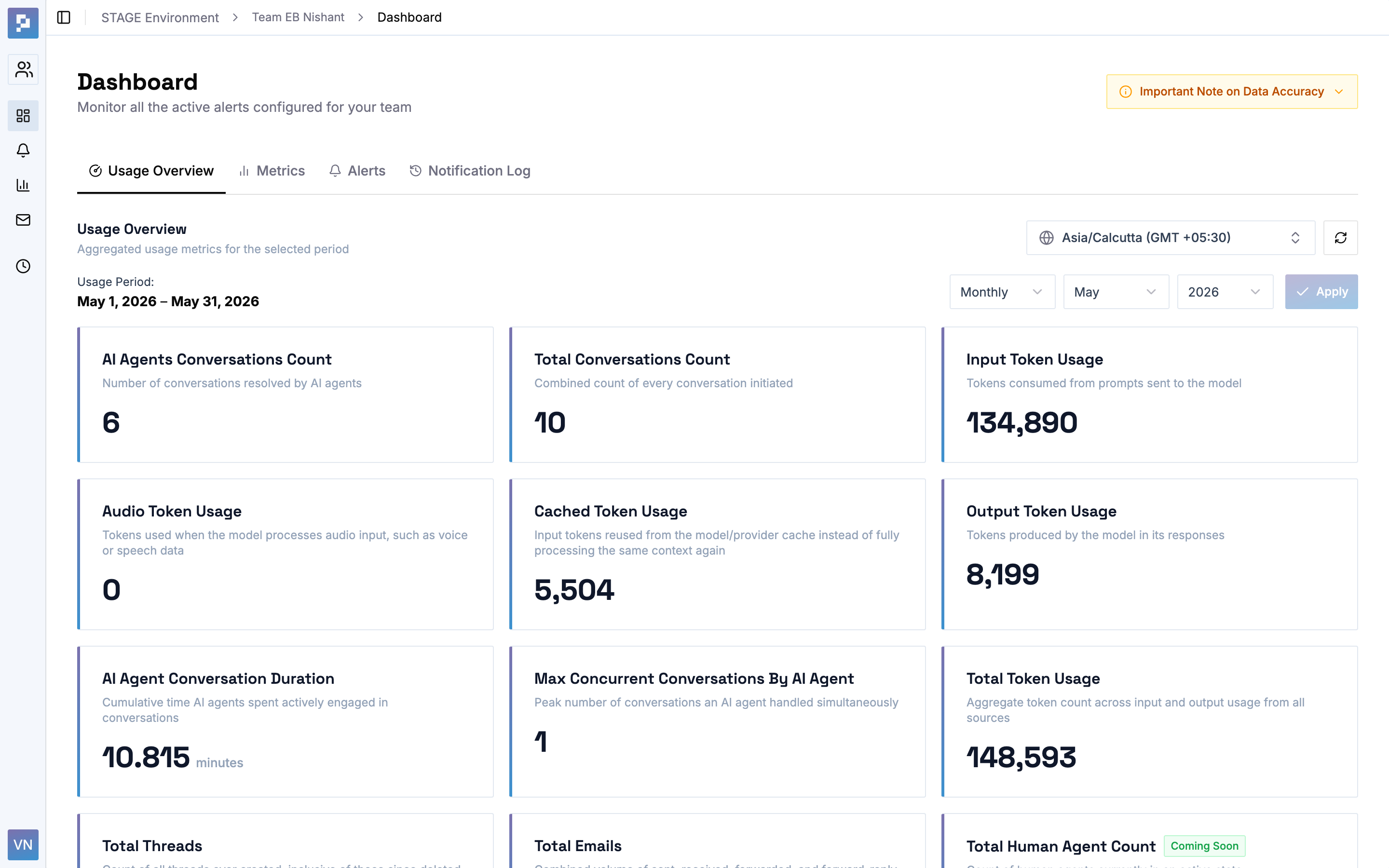
An enterprise alerting and metrics-management dashboard that turns raw usage data — metric, tokens, subscription cycles — into proactive, threshold-based notifications. I designed and built the product end-to-end, from information architecture and a role-adaptive UX to a token-driven design system shipped as a production micro-frontend.
Product Designer & Front-End Developer, end-to-end
B2B SaaS · Enterprise dashboard · Micro-frontend
React · Vite · Radix UI · Tailwind CSS
2026
At Enterprise Bot, the agents/ bots platforms generate a constant stream of usage data — metrics, tokens — but that data is only useful if the right person hears about the right number at the right time.
Teams were monitoring usage reactively, discovering that a token quota was blown or a subscription lapsed after it happened. And admins overseeing many teams had no single place to see who was at risk.
The design challenge was to turn raw, multi-dimensional usage data into a system where a non-technical user could confidently answer three questions.
What's my status right now?
What will go wrong, and when?
Who gets told when it does?
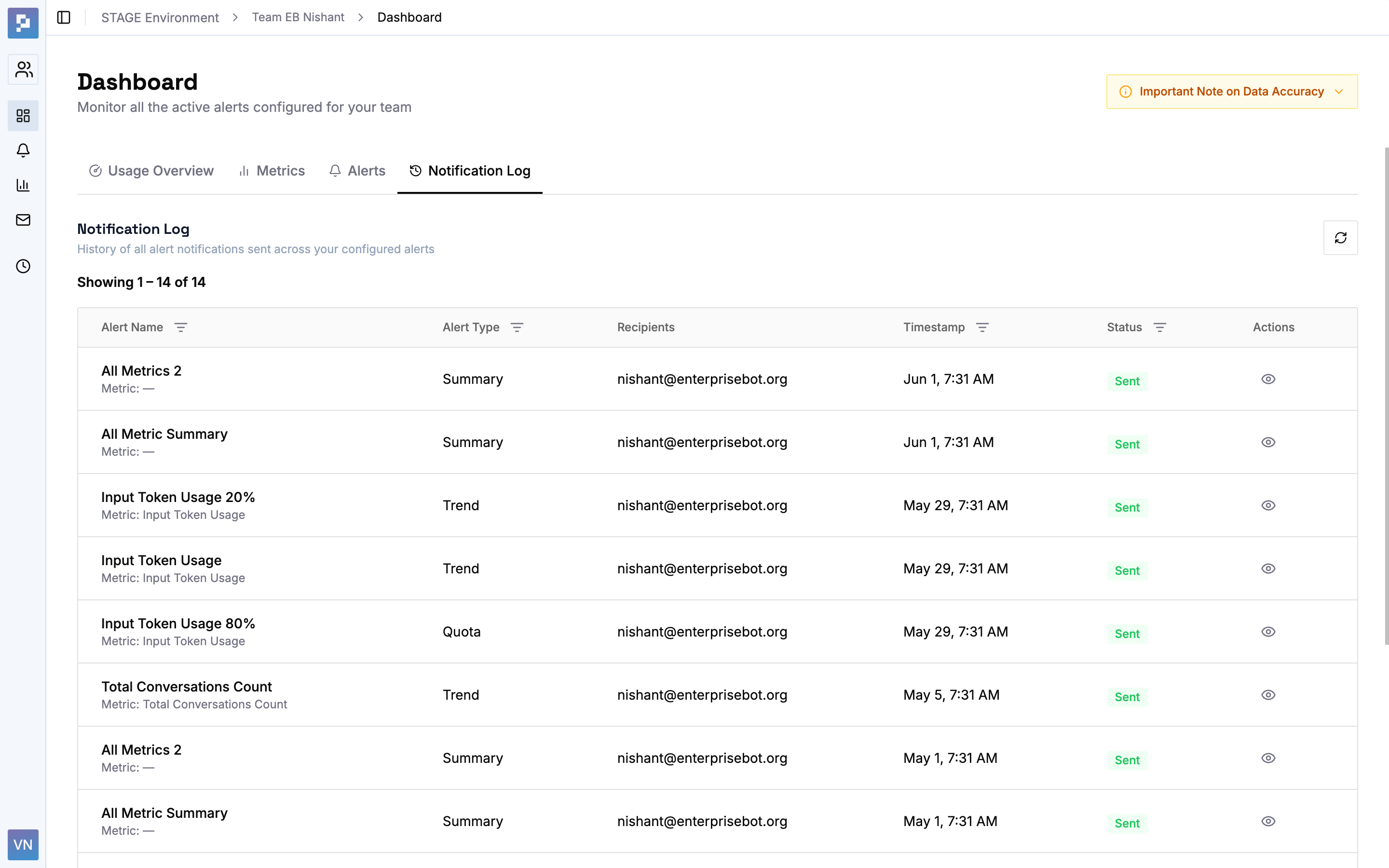
The home experience moves from health → detail → history: a live Usage Overview with timezone-aware date ranges, a Metrics view where each card signals status, quota consumption, and trend direction at a glance, an Alerts view, and a Notification Log as the audit trail.
A small but important interaction — the “View →” affordance on a metric — carries the user straight into the Alerts tab pre-filtered to that metric, preserving context across the jump.
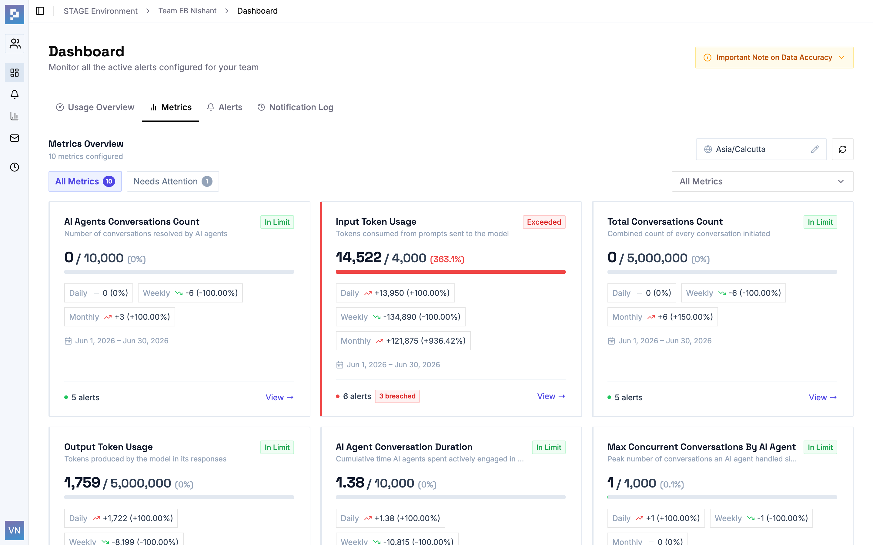 Metrics overview — status, quota, and trend at a glance
 Quota thresholds, subscription expiry, usage trends, and multi-metric summary digests each take different inputs — but share one progressive form, so users learn a single pattern: name it → choose a type → pick the metrics → set the threshold → choose the message → choose who hears it.
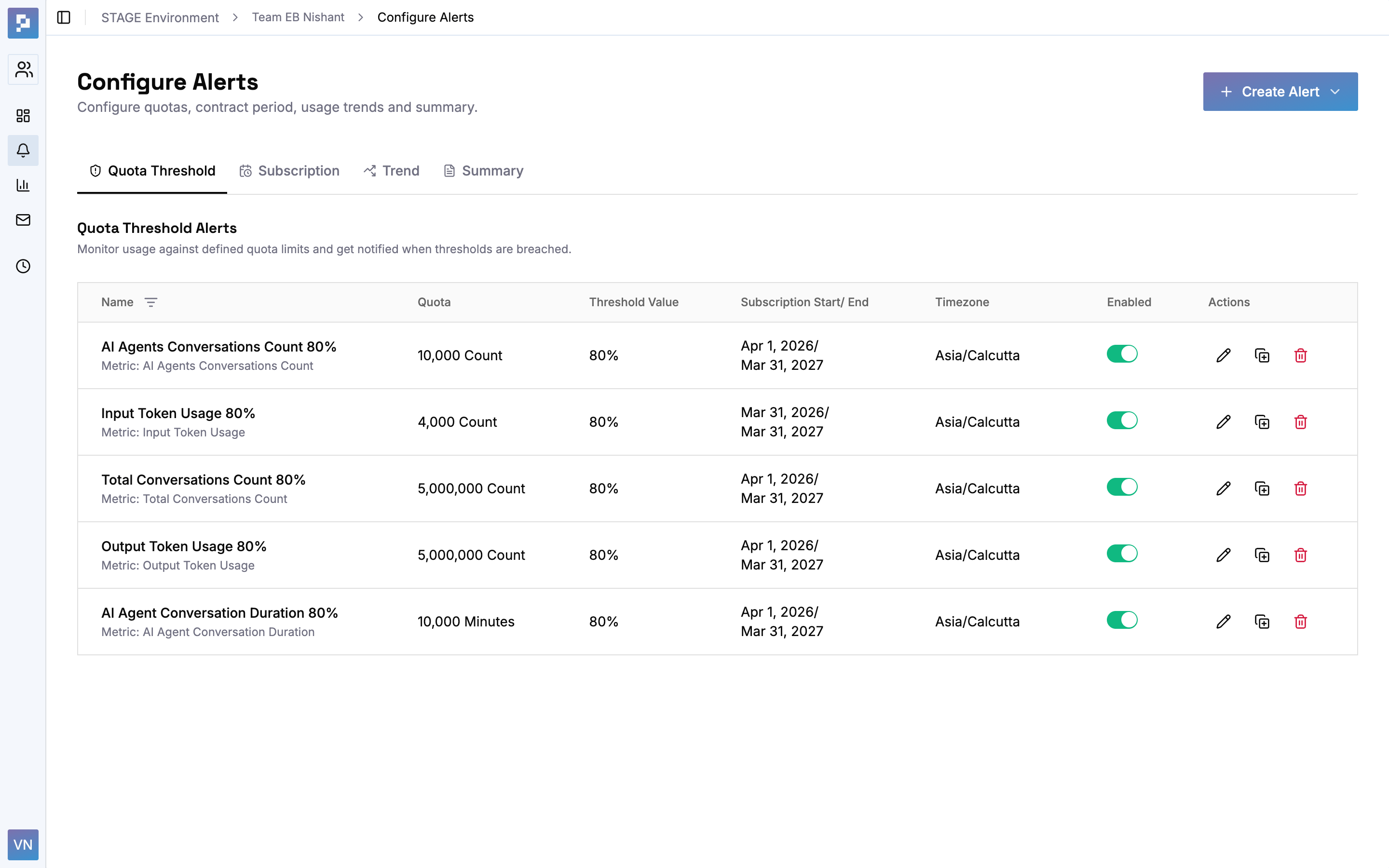 Configure alerts — quota · subscription · trend · summary
 Alerts are only as good as the message they send. Alerting System includes a rich-text email-template system — a WYSIWYG editor with template variables — letting teams own the voice and content of their notifications rather than receiving generic system emails.
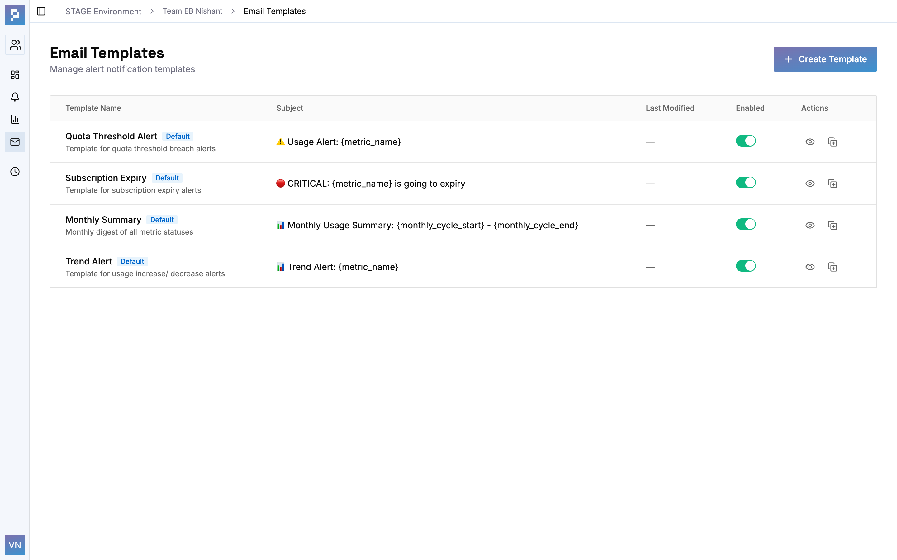 Email templates with metric-name variables
 The same screens adapt to who’s looking. Environment admins get a global view across every team, can drill into any team’s configuration, and export environment-wide reports — with breadcrumbs keeping them oriented as context swaps beneath them.
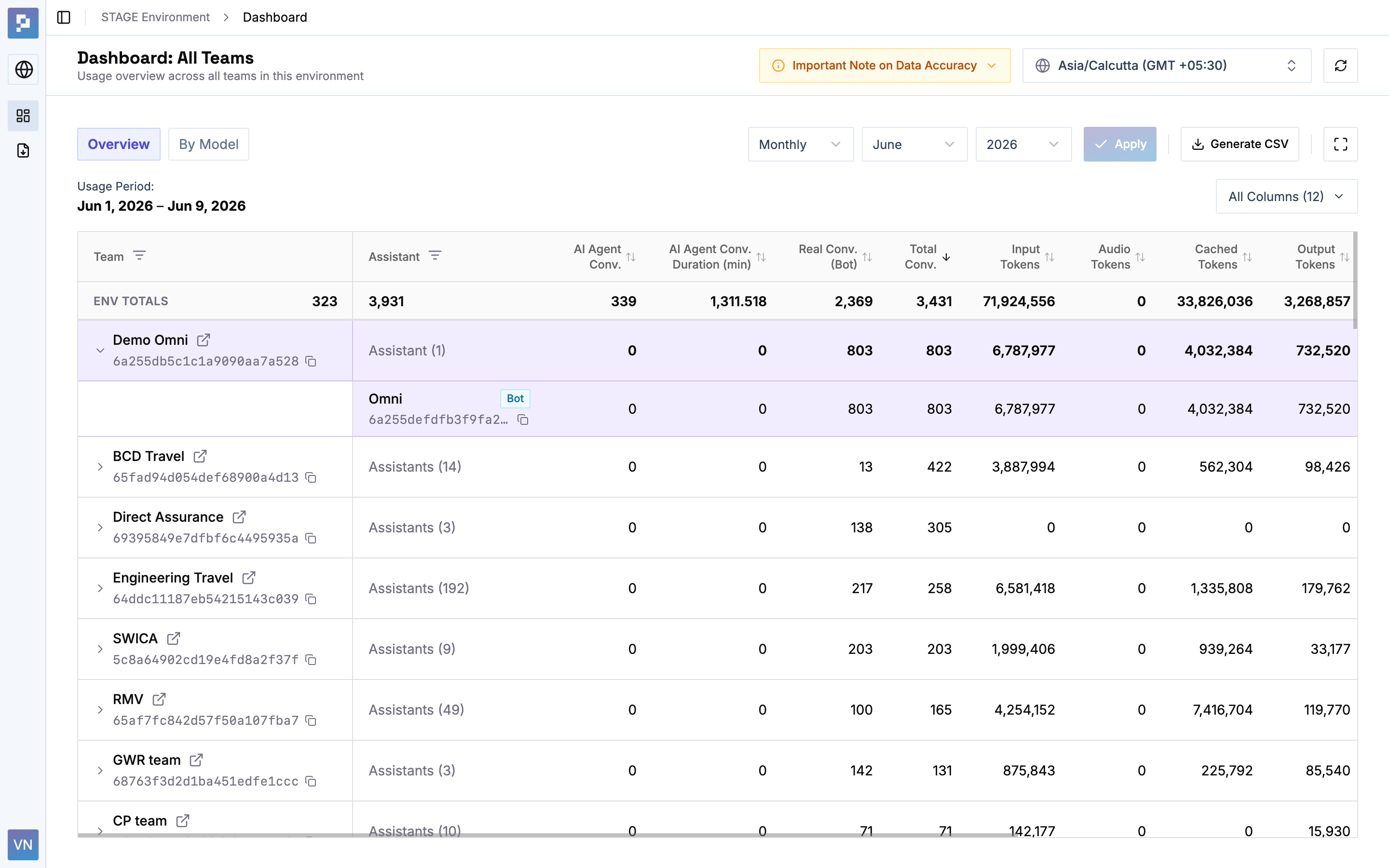 Admin view — every team, one table
 Rather than letting users create orphaned configurations, the system performs dependency checks — you can’t delete a metric or template that an active alert relies on, and the UI nudges you toward cleanup instead of failing silently.
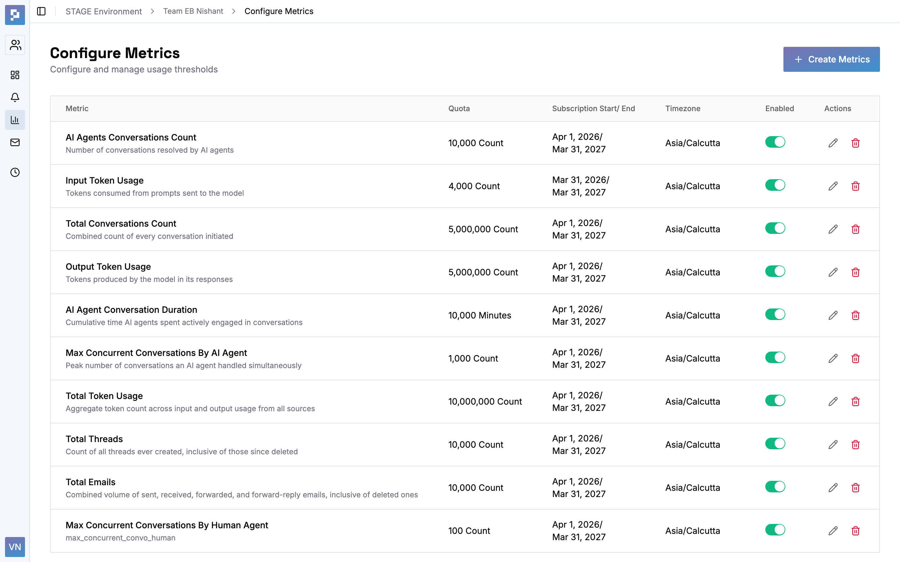 Configure metrics — dependency-checked deletes
 I built Alerting System on a three-tier design-token architecture. The foundation made a fully realized dark mode — mapped to the GitHub Primer palette — a matter of swapping semantic values rather than re-styling components, and kept roughly 50 reusable, accessible UI primitives built on Radix visually consistent.
Accessibility was designed in via semantic HTML, ARIA-compliant primitives, and consistent focus treatment.
Primitives — a 4px grid, a 1.25× type scale, elevation, motion, radii.
Semantic — background / foreground / primary, plus a full critical · warning · success · info status palette.
Component — tokens for dashboard cards, tables, and metric summaries.
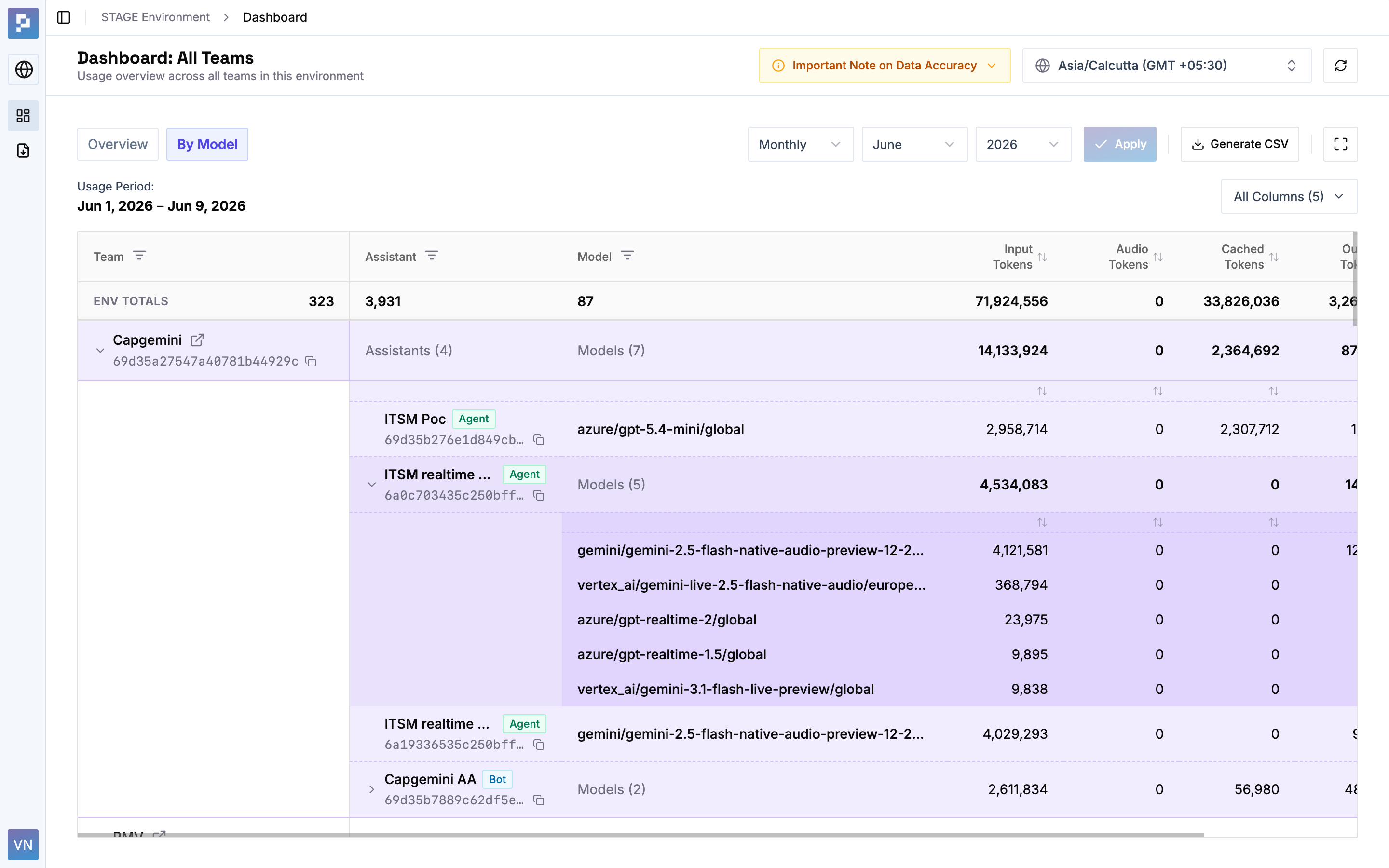
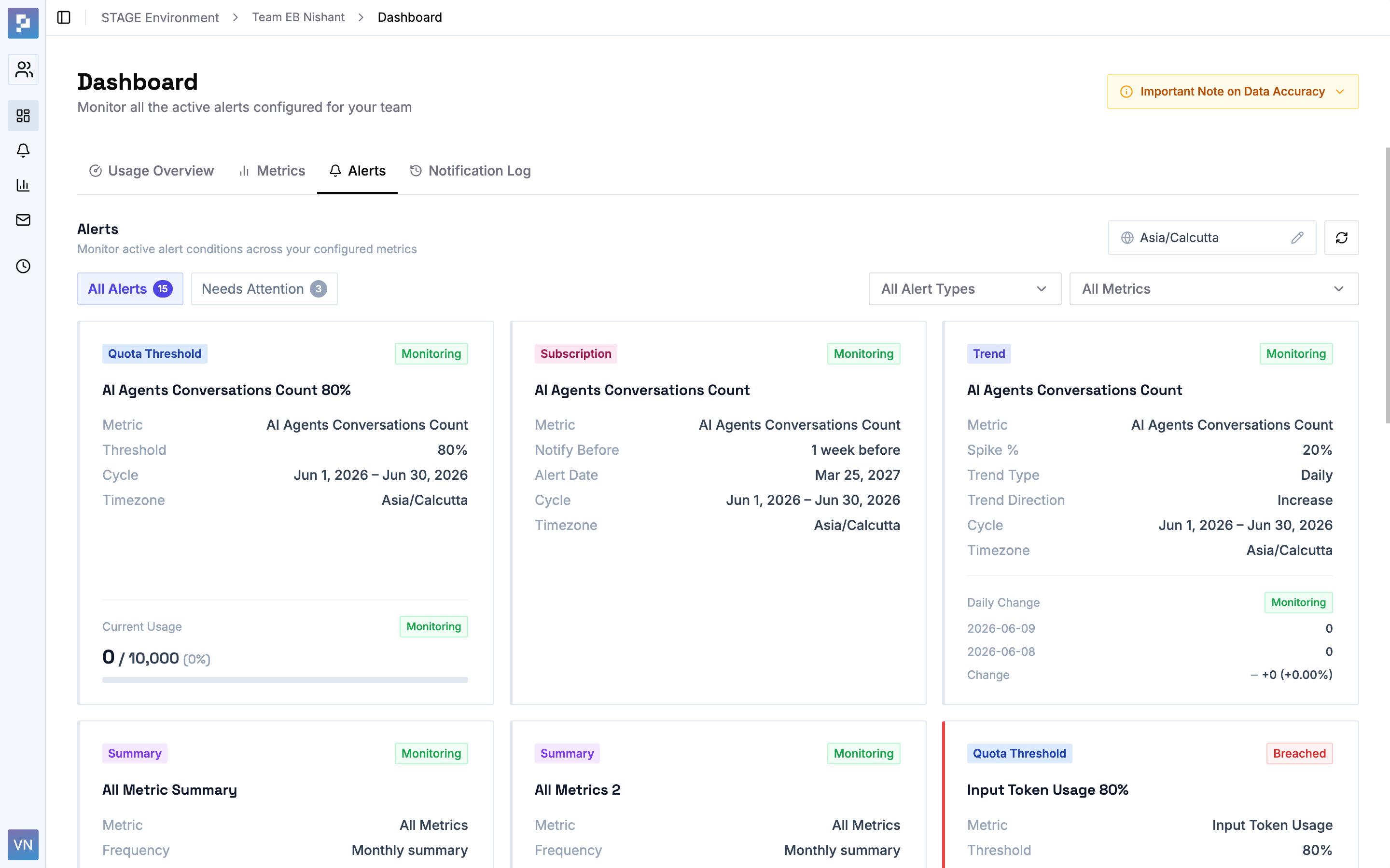
A single progressive form for structurally different configurations, lowering the learning curve for non-technical users.
Environment admins, team owners, and members served from one design system — no separate apps.
Light/dark theming and consistent componentry across ~50 primitives, implemented directly in the production codebase.
Metric → filtered alerts, environment → team drill-in — users stay oriented in a data-dense product.