A bill-splitting app that makes settling up with friends feel less like accounting and more like reading a receipt. I gave it an editorial, receipt-paper identity and designed and built it end-to-end — from a local-first onboarding that lets you split a bill before you ever sign up, through a token-driven design system, to a production React front-end backed by Supabase. Splizza is still in active development — a live prototype is up at www.splizza.com.
Product Designer & Front-End Developer, end-to-end
Consumer app · Mobile-first web · Local-first
React 19 · Vite · TypeScript · Tailwind v4 · shadcn/ui · Supabase
2026
Splizza is designed around the moment that actually matters — the table at the end of a meal, when someone has to work out who owes what. Rather than presenting itself as a finance ledger, it borrows the visual language of the thing it replaces: a paper receipt.
The established tools are capable but front-load friction: create an account, make a group, add everyone — and only then can you do the one thing you opened the app for. For a category whose core use case is spontaneous and in-person, that’s a lot of ceremony before any value.
The design challenge was to make the math disappear and let a non-technical person confidently answer three questions, ideally before they ever commit to an account.
What did everyone order, and who's paying?
So who owes whom, and how much?
What's the simplest way to actually settle it?
The primary onboarding flow is intentionally a skip. A first-time user can land, start a split, assign items, and reach a clear per-person result without creating an account — the moment of value comes first.
Authentication (magic link, Google, or guest) is optional and additive: when someone does sign in, their locally-held data migrates up to the cloud instead of being discarded, so committing to an account never feels like starting over.
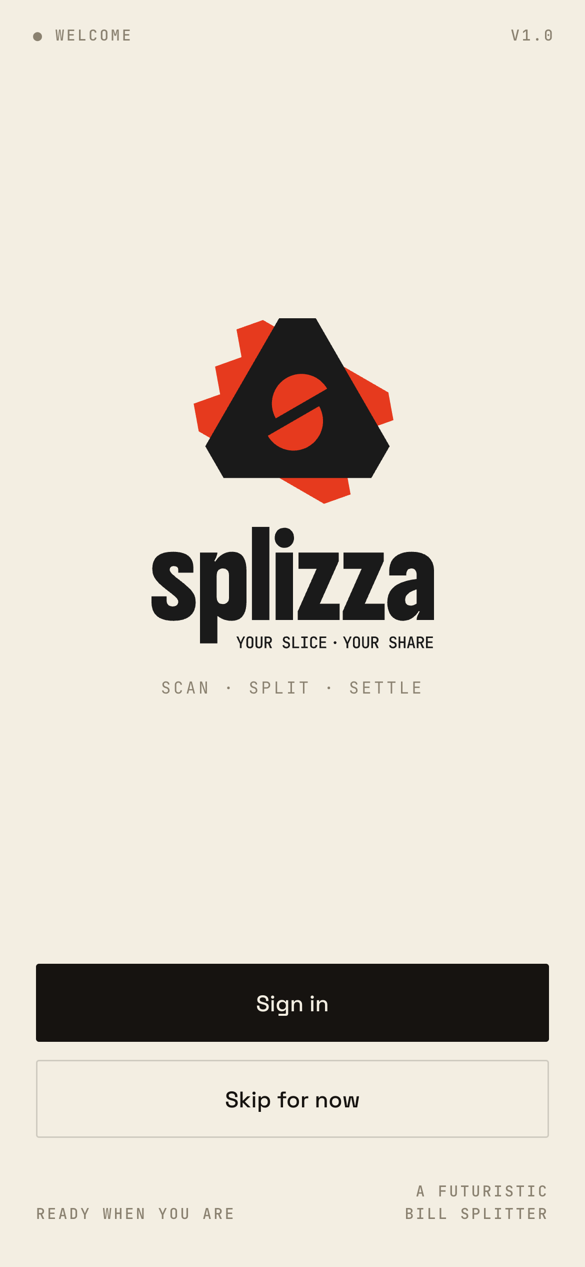 Welcome — "skip for now" is the hero path
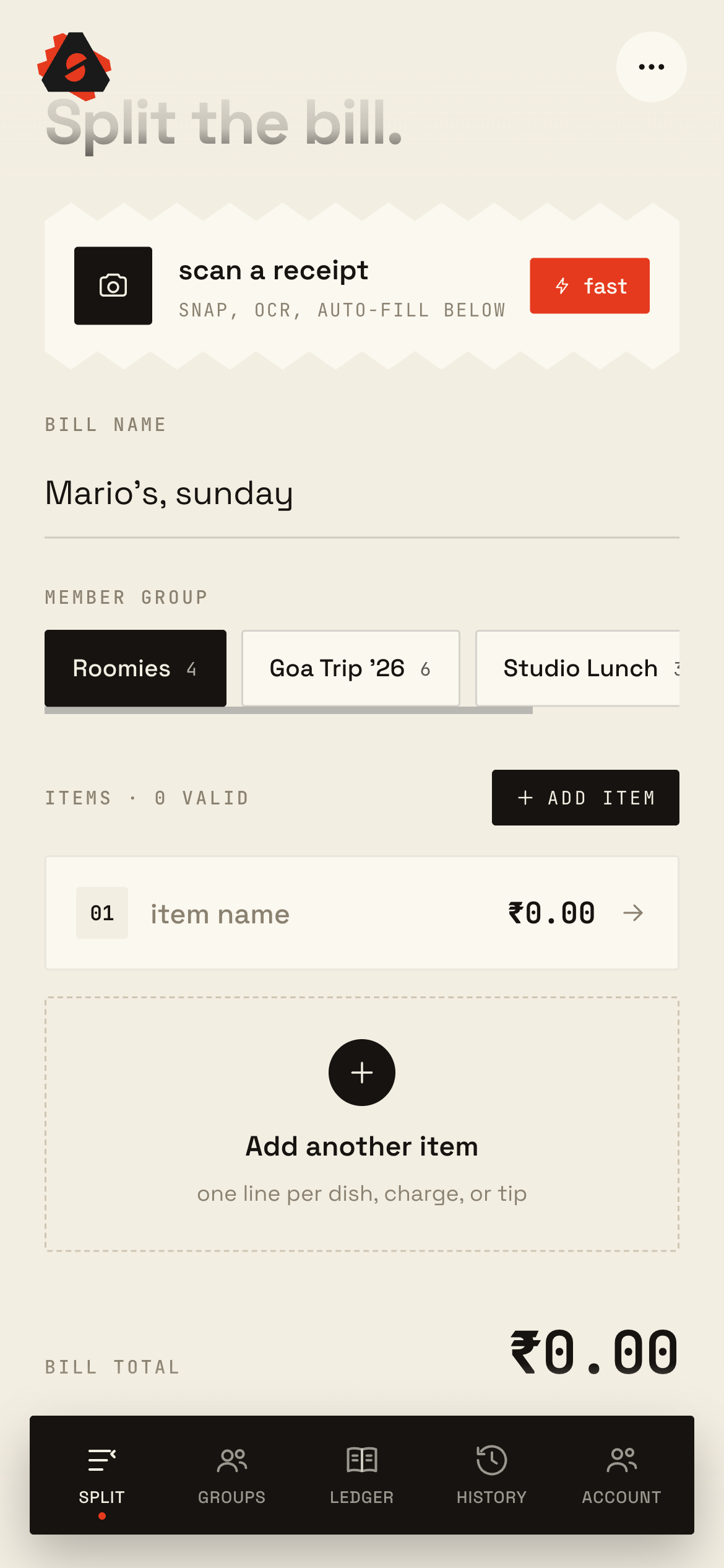
 Even-split is the easy case; real bills aren’t even. Splizza supports assigning individual line items to the specific people who ordered them, designating who actually paid, and resolving everything into clean per-person totals.
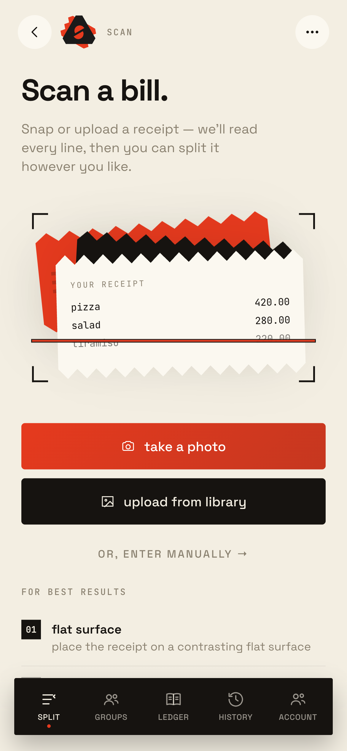
The flow is one coherent sequence — enter or scan the bill → assign items → choose the payer → see the result — and reusable split templates remove the repeated setup for the groups you settle with regularly.
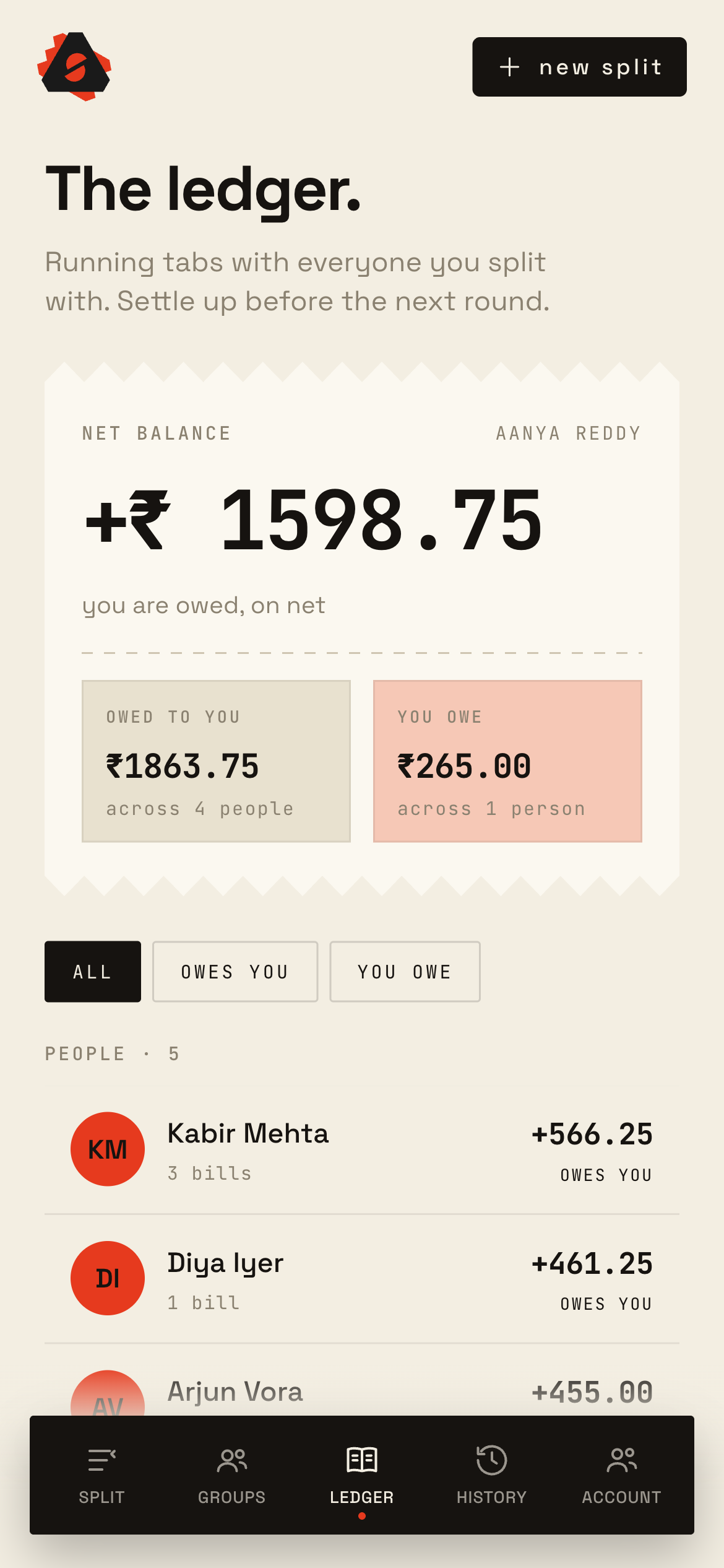
One line per dish, charge, or tip The default landing experience is the Ledger: where you stand right now across all your groups — net balance up top, owed-to-you and you-owe side by side, people ranked beneath.
From there, a settle-up path simplifies a web of who-owes-whom into the minimum set of payments — the difference between “five people owe four other people” and “two payments and you’re done.”
The ledger — "where do I stand?" at a glance Most apps in this category default to friendly blue-and-green utility design. I went the other way: warm bone-colored “paper” surfaces, a near-black ink palette, a vermillion accent, and receipt cards with genuine zigzag torn edges rendered via CSS clip-path, not image assets.
It’s a look that signals receipt, not spreadsheet — distinctive in the grid and faithful to the real-world object it stands in for. Six color schemes ship selectable out of the box, alongside a fully realized dark mode.
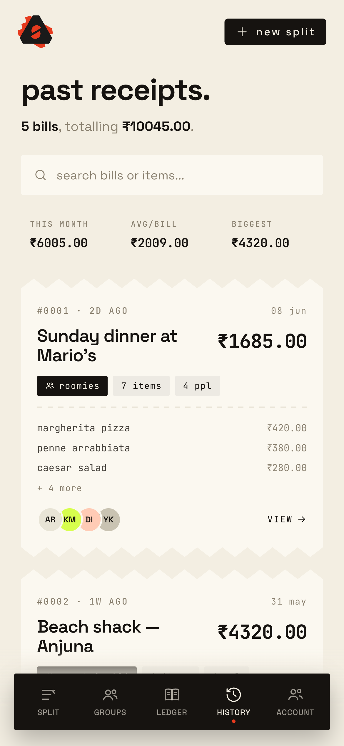 Receipt cards with real torn edges
 Splizza is built on a design-token foundation expressed as CSS custom properties — paper and ink surfaces, the accent palette, spacing, and radii — bridged into Tailwind v4 and a set of shadcn/ui primitives built on Radix.
The bridge layer is where the system earns its keep: shadcn’s component tokens are mapped onto the receipt-paper variables, so changing the color scheme — or switching into dark mode — re-themes roughly 25 accessible UI primitives in one value swap, with no component-by-component restyling.
Accessibility came along for free where it mattered, via Radix’s ARIA-compliant primitives and consistent focus treatment, while bespoke touches — the zigzag receipt edges, the circular checkboxes and switches — preserve the hand-made, paper feel on top of the accessible base.
Money logic stays pure and portable. Ledger computation, per-member totals, and currency formatting live in a DOM-free core, testable in isolation — so a future native client could reuse the same logic without a rewrite.
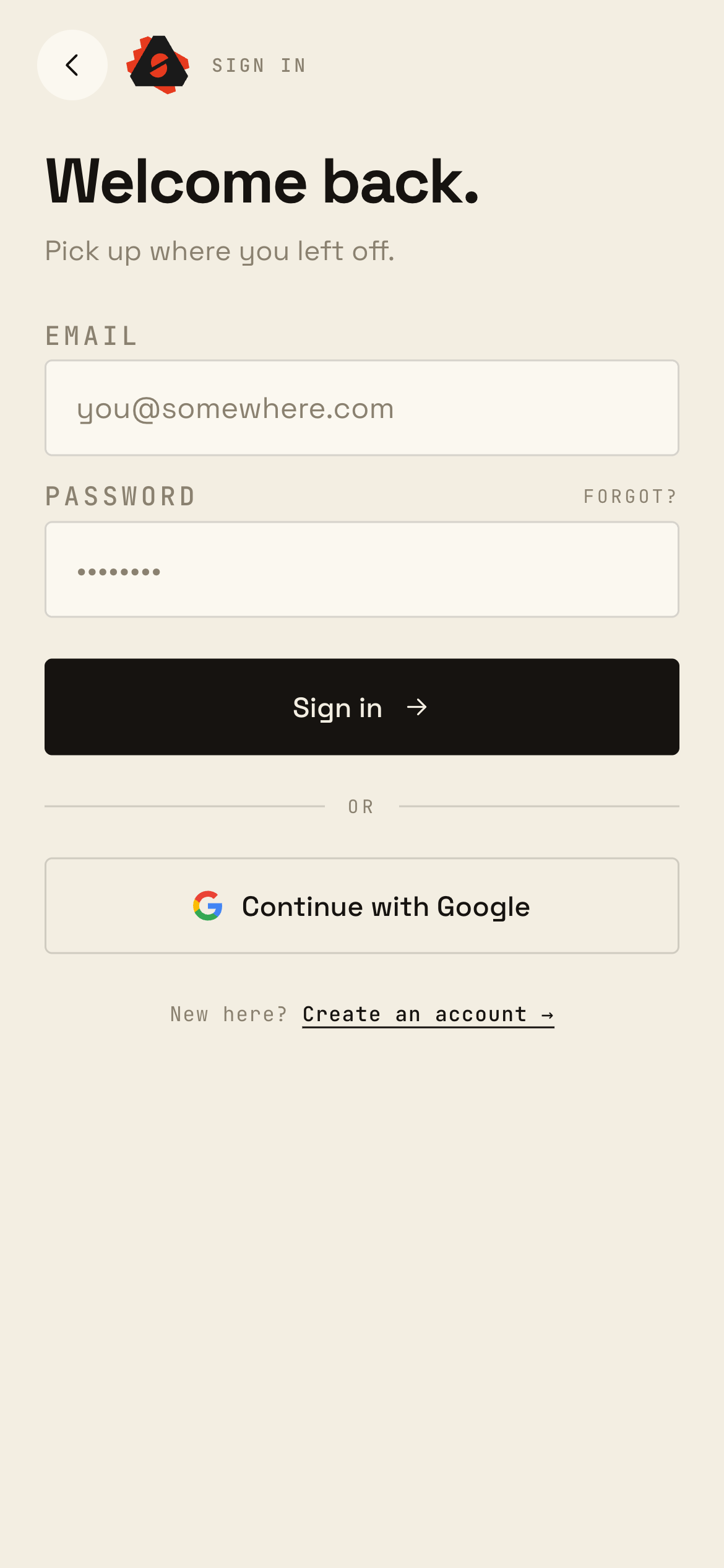
An optional Supabase backend provides authentication (magic link, Google, guest) and a relational data model — groups, members, bills, line items, splits, and settlements — with row-level security so a user only ever sees the groups they belong to.
The standout piece is the anonymous-to-cloud migration: data created before signup is remapped and synced up on first authentication, and a server-side debt-simplification routine computes the minimal set of settlements. The UI stays name-based and friendly while the backend normalizes everything behind the scenes.
Auth is additive — signing in never discards local data.
Row-level security scopes every query to your groups.
Debt simplification resolves the fewest payments server-side.
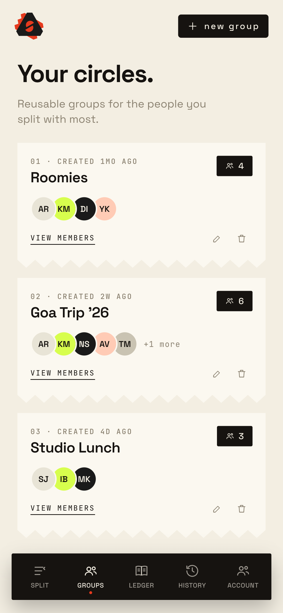
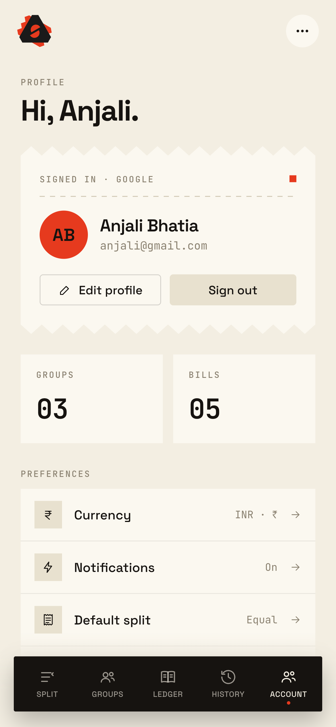
Receipt paper, ink, and vermillion — a utility app made memorable without sacrificing clarity.
Value before commitment, with a lossless local→cloud migration when the account upgrade happens.
Messy real-world bills resolved into the fewest payments needed, via debt simplification.
Six color schemes and a full dark mode are a single value swap across ~25 accessible primitives — implemented in the production codebase.
Money math kept portable toward a future native client.